Reading an aging curve
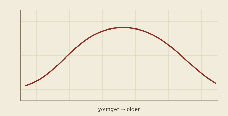
Underneath almost every system in these indexes is the same quiet assumption: players get better, then they get worse, and the turn happens somewhere in the middle. Draw that as a line and you get the shape above, which is the most reused idea in baseball forecasting and also the one most often misread.
The first misreading is treating the curve as a biography. It is not. It is an average built across many careers, and averages of careers are strange objects, because the players still in the league at the older ages are the ones who did not decline. Survivor effects flatten the right-hand side of the curve. Systems handle that differently, and the differences show up in exactly the places you would expect: veterans coming off a good year.
The second misreading is treating the curve as universal. Skills do not age together. Power and patience tend to hold longer than speed and contact quality; the components of pitching separate even more sharply. A system that ages every statistic on one shared curve will be systematically wrong in a way that is easy to spot after the fact and hard to fix before it.
The practical use of the shape is modest. It tells you which direction a forecast should lean when a player is young and which direction it should lean when he is not, and it warns you off any projection that simply repeats last season. That is a small amount of information, but it is the part that repeats.